cities. physics. food. environment. fatherhood.
Random header image... Refresh for more!

Category — doing the math

DC intersections with Mathematica

Without the quadrant designation, several intersections in Washington–”6th and C,” for example–are ambiguous. “6th and C” can refer to a place in NW, NE, SW, or SE DC. Because of this duplication of streets and intersections, the quadrant is usually–but not always–specified. I’ve been curious  for some time to know exactly how many doubly-, triply-, and quadruply-redundant intersections there are in DC, and it’s another fun example combining Mathematica 7’s .shp file import with the GIS data that the DC government makes available.

How many are there? I calculate:

Quadrants: 2 3 4
Intersections: 418 71 28

The 28 intersections that appear in all 4 quadrants are:

14th & D, 9th & G, 7th & I, 7th & E, 7th & G, 7th & D, 6th & C, 6th & G, 6th & D, 6th & I, 6th & E, 4th & M, 4th & G, 4th & E, 4th & D, 4th & I, 3rd & M, 3rd & C, 3rd & K, 3rd & D, 3rd & G, 3rd & E, 3rd & I, 2nd & E, 2nd & C, 1st & M, 1st & C, 1st & N

Plotted on a map:


Color coded map of intersections in DC.

Color coded map of intersections in DC.

Update: Here’s a larger PDF version.

Here’s how I made the map and did the calculations:

[Read more →]

March 1, 2009   4 Comments

Red Street, Blue Street

In the end, I went with the upgrade to Mathematica 7. Of all the new features, the one that really hooked me–which is comparatively minor, compared to all the other new features–is the ability to import SHP files. The importation is not terribly well documented nor is there much additional support, but it was pretty easy to do a few nifty things with the DC Street Centerline file.

As you may know, there is a street in DC for every state in the union. Pennsylvania Avenue is probably the most famous of these; the White House sits at 1600 Pennsylvania Ave NW. I used to live on Massachusetts Avenue. So my first idea was to make a street map of DC in which the state-named streets were colored red-ish or blue-ish depending on their vote in the recent election.

Here it is:

Read on to see how I made it:

[Read more →]

January 17, 2009   1 Comment

The next Mathematica

To me, an intermediate and somewhat casual Mathematica user, the news that Mathematica 7 had been released was a surprise. Surprising to me because Mathematica usually goes much longer between major-digit releases; I would have anticipated this to be Version 6.1. For fun, I’ve plotted the history of Mathematica versions1 :


Release dates of versions of Mathematica

Release dates of versions of Mathematica

Mathematica 6 was a substantial upgrade: the graphics system was completely overhauled, the curated data, that I’ve used as the basis for some posts here, was added, and the ability for dynamic interactivity was added with Manipulate and Dynamic

I am not, of course, a major Mathematica user. In fact, although I’m a physicist, I haven’t made tremendously much use of Mathematica for my professional work. This is partly because I tend to deal with relatively small data sets, for which a GUI-based data analysis tool is usually easier to work with than the command-line Mathematica. And I’d consider myself an advanced user of Pro Fit, the data analysis tool that’s made all the graphs for all the work I’ve done since about 1998.

In fact, my Mathematica license is my own personal one. As a graduate student, I bought the Student version of Mathematica, which they allow you to upgrade to a full professional license for only a few hundred dollars, compared to the $2500 list price of a new professional license.

Wolfram really wants its users to buy Premier Service, a several hundred dollars per year service which entitles you to all upgrades, major and minor. If you don’t buy premier service, then you need to pay for all upgrades, even the N.M.X to N.M.X+1 minor bug-fixing upgrades. And without premier service, you’re not even supposed to install Mathematica on more than one computer. Draconian and greedy, if you ask me, but they can do that, because they’re Wolfram. And for tech-heavy firms that make heavy use of Mathematica and get millions of dollars worth of value from whatever they compute in Mathematica, it makes sense. But it makes it very difficult to be a casual user.

And even though your existing copy can do everything it could the day you bought it, once the difference between your copy and the current release gets large enough, there is no longer an upgrade path. I think this is one of the motivations to release this as version 7 and not 6.1: I don’t recall the precise figure, but Wolfram generally offers an upgrade path only for jumps smaller than 1.5. If this is still the case,2 what this does is cut off anyone who hadn’t upgraded to version 6. Update: enough with the conspiracy theories! Wolfram clears up the upgrade policy in the comments.

In my case, with Version 6.0.1, I have a choice of paying $750, and getting a year of Premier Service, or paying $500 for just version 7.0.0 with no service. Out of my own pocket, ouch! But what makes it really enticing, for me, is that Mathematica now reads SHP files. These are the Geographic Information System data files, promulgated by ESRI, in which vector-valued geographic data is commonly exchanged. In particular, the DC Office of Planning makes an amazingly large collection of DC GIS data available in SHP format. The possibility for quantitative analysis of DC mapping data is very tantalizing.

Of course, Wolfram wouldn’t release a major number upgrade without hundreds of other new features. As of yet, there isn’t much substantial written about version 7. I did find some notes from a beta-tester and from a college math teacher. I’ll probably buy it, even though it would mean delaying other expensive toys that I want.

  1. most of the dates come from the Wolfram News Archive, some from the Mathematica scrapbook pages []
  2. I’ve asked Wolfram, but haven’t received a reply. []

November 22, 2008   3 Comments

Twenty megawatts in your hands

I needed to buy more gasoline for the car today, and I decided to see how long it took to fill the tank. I bought ten and a half gallons of gas, and it took 70 seconds to fill it up. Although filling up a gas tank is something that millions of Americans do every day, it’s really remarkable when you stop and think about the energy transfer going on.

Gasoline has, approximately, 113,000 BTUs per gallon.1 One BTU is 1055 Joules. So I transferred 1.25 Billion Joules in those 70 seconds, which is a rate of 17.9 megawatts. When you consider that you spend less than two minutes pumping the same amount of energy you burn in four hours of driving, it’s not surprising that you end up with such a high power. What’s more interesting, I think, is to contemplate the rather fundamental limits this puts on plug-in electric cars.

Internal combustion engines, according to Wikipedia, are only about 20% efficient, which is to say, for every 100 BTUs of thermal energy consumed by the engine, you get 20 BTUs of mechanical energy out. This is, in large part, a consequence of fundamental thermodynamics. Although electric motors can be pretty close to perfectly efficient, a similar thermal-to-electric efficiency hit would be taken at the power plant.

Let’s consider, then, that we want a similar car to mine, but electric. Instead of 1.25 gigajoules, we need to have 250 megajoules. Battery charging can be pretty efficient, at 90% or so, which means we’d supply 280 megajoules. If we expect the filling-up time to be comparable to that of gasoline cars–call it 100 seconds for simplicity–then we’d need to supply 2.8 megawatts of power. At 240 Volts, which is the voltage we get in our homes, this would require 11700 amps; if you used 1000 Volts, it would take 2800 amps. Although equipment exists2 to handle these voltage and current levels, it is an understatement to say that it cannot be handled as casually as gasoline pumps are handled. Nor is it clear that any battery system would actually be able to accept this much power.

A linear relationship exists between the power requirement for filling, and the vehicle range, the vehicle power, and the time for a filling. If you’re satisfied with half the range of a regular vehicle, for example, you could use half the filling power. Let’s imagine that you’d be happy for the filling to take ten times as long as with gasoline, or 1000 seconds, just under 17 minutes. At this level, you’d need 280 kilowatts of power. If battery charging is 90% efficient, that means 10% of the power is going to be dissipated as heat, which in this case would be 28 kilowatts.

For comparison, a typical energy consumption rate for a home furnace is 100,000 BTU per hour, about 28 BTU per second, or 29.3 kilowatts. Which means that the waste heat dissipated during charging for the example–of a 1000 second fill for a vehicle with similar range and power as a modest gasoline powered sedan, at 90% charging efficiency–is as much as the entire output of a home furnace.

No wonder overnight charges are the standard.

  1. Summer and winter blends have slightly more and less, respectively. []
  2. think about how large the wires would need to be []

November 13, 2008   4 Comments

Dow Jones and Mathematica

A recent post by economist-blogger Brad DeLong, which was also picked up Matthew Yglesias, mused upon the clustering of the Dow Jones Industrial Average clustered near values starting with 1. He showed a chart with the years 1971–1984, and 1996–2008 circled, when the Dow appeared to fluctuate near 1000 and 10000, respectively. Many commenters quickly jumped to point out that this was an example of Benford’s Law, which says, essentially, that if you’re throwing darts at a logarithmically shaped dartboard, you’re going to hit “1″ more often than any other digit. If you pick random values of some phenomenon that is logarithmically distributed, you should get values beginning with “1″ about 30% of the time, which makes sense if you’ve ever looked at log scale graph paper.

It occurred to me that this is an easy thing to investigate with Mathematica, much like my earlier post on the Bailout. Mathematica 6 includes access to a huge library of curated data, including historical values of the Dow Jones Industrial average and other indices (and individual stocks, and so forth). The function here is FinancialData, which Wolfram cautions is experimental: I believe they get the data from the same source as, say, Yahoo! Finance, and just do the conversions to make it automatically importable into Mathematica. That is, it is no more reliable than other web-based archives. The computations are absurdly easy, taking only a few lines of Mathematica code. 

The graph I (eventually) produced shows the relative frequencies of first digits that are calculated by Benford’s Law, together with the relative frequencies of the leading digits from the Dow Jones Industrial Average, the S&P 500, the NASDAQ Composite index, the DAX 30, and the Nikkei 225:


[Read more →]

November 1, 2008   No Comments

Bailout and Mathematica

A friend of mine (and regular commenter here) has pointed out that, even if the $700,000,000,000 bailout passes, and adds to our National Debt, we’d still have a Debt-to-GDP ratio that was less than Germany’s.1 Wikipedia says that the US National Debt is 60.8% of our GDP, that Germany’s is 63.1%, and that our GDP is $13.8 trillion. Well, add $700 billion to 60.8% of $13.8 trillion and the new figure is 65.8%–pretty close; there are different ways of measuring both GDP and the Debt.

But I realized that this sort of comparison is something that Mathematica 6 is supposed to be good at. Mathematica is an amazingly powerful system for doing mathematics on a computer. Its strength, traditionally, has been symbolic manipulation–I most often use it for the Integrate command, which can do most of the integrals that in grad school I’d look up in Gradshteyn and Ryzhik. Version 6 has added, amongst other things, a huge library of curated data, loaded over the Internet, that’s relatively straightforward to use.

The command CountryData gives access to all sorts of country-by-country information, including “GDP” and “GovernmentDebt”. So following one of the examples in the documentation, I produced this graph, plotting the Debt-to-GDP ratio versus GDP for (nearly) all the countries for which Mathematica has data. (Note that the x-axis is a logarithmic scale.) The United States, before and after a $700 billion bailout, are shown in green and red, respectively.

If the xhtml export actually works the way it’s supposed to, you should be able to hover your mouse cursor over each point and have a little ToolTip pop up telling you which country the data are for.
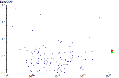
"debtgdp.xhtml_1.gif"

GDP [$US]

Mathematica has a syntax that strikes many as arcane. Since I learned about computers with procedural programming, and haven’t really done any functional programming, I too struggle to get Mathematica to do what I want it to do. But one can often do complicated things, such as the above graph, with a very compact command. To make the main graph–the red and green dots are relatively trivial additions–the command I used is:
[Read more →]

  1. He is, nevertheless, against the bailout. []

October 1, 2008   1 Comment

Iced tea

I like to make iced tea during the summer months. Not that vile powdered stuff, but real tea or herbal infusions. To make it quickly–so one doesn’t have to wait for near-boiling tea to cool all the way down to an icy-cold temperature, I prefer to brew double-strength tea and pour it over ice, such that most of the ice melts, and the near-boiling tea cools, together making an appropriately strong chilled drink.

How much ice does one need? Well, to cool 1 gram of boiling water down to the freezing point, 100 calories1 have to be extracted from it. Melting 1 gram of ice takes about 80 calories of heat. So a mixture of 56% (by weight) ice and 44% boiling tea will melt all the ice and leave the final mixture at 32°F.

How do you measure this amount of ice? Well, you could weigh it, but that’s not always convenient. Here’s a bit of mathematics to justify a simple approximation: The density of ice is approximately 92% that of liquid water. If you fill a container with ice cubes–or with any solid particles, for that matter–there is a fair amount of air space between the grains. If ice cubes were spherical, then only about 64% of the volume would be ice, and the rest air–this is known as the random close-packed fraction. Ice cubes aren’t spheres, but the fraction should be roughly the same. Which means that if you fill a container up with ice cubes, they would melt to a volume about 59% of that of the container. If you add 50% of the volume of the container of boiling water, the ice would represent about 54% of the total mass of water and ice, and mixing the two together you’d end up with a volume of liquid equal to 109% the volume of the container, at 32°F. To avoid overflow, you’d need to use slightly less ice and boiling water.

So, my iced-tea algorithm:


  1. Fill a container most of the way up with ice cubes
  2. Measure out as much tea as you need for the full volume of the container
  3. Brew the tea using a volume of water that’s slightly less than half that of the volume of the container
  4. Pour the brewed double-strength tea (through a strainer, if necessary) into the ice-filled container
  5. Stir to cool the tea and melt the ice; most of the ice will melt. Since the brewed tea will have cooled off a bit while steeping, it won’t have enough heat to melt all the ice and so there will still be some ice left.


The tea leaves will absorb some of the water, and many containers hold (slightly) more than their nominal volume, so using (say) exactly 1 quart of water to make tea in a 2-quart container shouldn’t present any problems.

To brew, I’ve adopted the Cook’s Illustrated technique of mixing the tea and cold water in a saucepan, heating over medium heat to 190°F, then shutting off the heat to let steep for 3 or so more minutes: all total, the brewing should take about 15 minutes.

I’m fond of a mint infusion: for a 2 quart container, use 2 Tablespoons dried mint. I also like minted iced tea, for which I use a mixture of 4 teaspoons loose tea plus 3 teaspoons mint for a 2 quart container.

  1. Thermodynamic calories, not food Calories. A food Calories, spelled with a capital C, is 1000 thermodynamic calories. []

July 2, 2008   2 Comments

Paul Sally.

The recent issue of the alumni magazine from my undergraduate alma mater, The University of Chicago, includes a profile of mathematician Paul Sally, who taught the Honors Analysis in Rn sequence I took in my second year. 

Despite the rigorously intellectual image of itself that the University promotes, the alumni magazine is usually as circumspect as an in-flight magazine. Of course the primary purpose of the magazine is to cultivate us as donors, so on-campus controversy, intellectual or otherwise, gets scant attention. The article on Sally certainly follows the magazine’s formula of uncritical boosterism, but I still found it a delight to read: it took me back to what was probably the most intellectually fulfilling experience of my academic career, a time when all the promotional slogans about the life of the mind were very real for me.

Although my enthusiasm for working in a lab led me to choose physics over mathematics, I still have a fondness for pure mathematics. I retain a handful of habits  that are more a part of math culture than physics culture.1 Sally’s course kept me on the fence between the two disciplines.

Sally delivered his classes entirely without notes, and the course rarely made reference to the assigned book (a cheap Dover reprint and a small volume from Spivak). He led a “discussion session,” Tuesday evenings from 6:30 until 8 or 9, stretching the amount of class time. He told us he expected at least 25 hours per week from us, at one point advising us to make posters which read “Mathematics… is a full time job.” It was mathematics by immersion.

Not every teacher can pull this off so successfully: it’s easy enough to assign lots and lots of work, but the combination of a heavy workload and an uninspiring instructor usually results in lots of incomplete assignments. 

Sally once remarked that, as you continue in mathematics, you get to a point where hard work is not only necessary, but also sufficient, to prove theorems and make progress. He was getting us to develop the sort of attitude and work ethic to reach that point.

There are many things I learned in college that I’ve now forgotten, many problems I can no longer solve. I don’t know how much review it would take for me to be able to solve the problems from Honors Analysis again, but, 15 years on, I feel I still have a well-developed understanding of the structure of the real numbers. 

Here’s another article about Sally, for winning a teaching award.

  1. In particular, I can’t stand the common-in-physics habit of using the word “finite” when what is really meant is “non-zero” or “infinitesimal.” []

May 29, 2008   No Comments

Scale in the media

I lamented in an earlier post that questions of scale are all too often left out of discussions of environmental solutions. To recent pieces that bring the issue up:

Michael Pollan’s Why Bother?, from last Sunday’s New York Times Magazine, opens by recounting what for Pollan was the “most upsetting moment” of An Inconvenient Truth: the “immense disproportion between the magnitude of the problem Gore had described and the puniness of what he was asking us to do about it.” Pollan defends notions of virtue and the steps, particularly gardening, that individuals might take to reduce their individual carbon footprints, vis-à-vis other responses to the climate crisis such as hopingfor some future technology. He writes: “Cheap energy, which gives us climate change, fosters precisely the mentality that makes dealing with climate change in our own lives seem impossibly difficult…. Al Gore asks us to change the light bulbs because he probably can’t imagine us doing anything much more challenging, like, say, growing some portion of our own food.”

Second, the April 12th Sierra Club Radio podcast has a segment with Bob Schildgen—Mr. Green—promoting his new book, which compiles questions and answers from his column in Sierra magazine. On the question of paper vs plastic (his answer–neither; bring your own bag), he encourages listeners to put things into perspective by mentioning that you likely burn as much petroleum in one trip to the grocery store as it takes to make all the plastic bags you’d use in a whole year. I can’t find his numbers online, but using the figures I wrote about earlier: 330 bags per American per year, 200 bags per gallon, so just over one and a half gallons of oil per American devoted to plastic bags. At 20 miles per gallon, you could make a round trip to a supermarket 15 miles away. Right order of magnitude, but I think you could travel a bit farther on that amount of gas.

This exercise in scale is then thrown out the window later in the interview, when host Orli Cotel asks the heavily loaded question: “For our listners who do own cars or need cars for whatever reason, what tips can you give us, as Mr. Green, to help reduce the amount of gas that we’re using,  besides of course cutting back on car travel?” (As if there’s some secret, magic way to drive without using gas that only the hardcore enviros know about.) Mr. Green goes on to mention that Americans lose about 4 million gallons of gasoline per day because of underinflated tires. Of course, he doesn’t put this into perspective: that’s about 1% of our daily gasoline consumption; we burn through 4 million gallons of gasoline in about 15 minutes.

April 25, 2008   No Comments

March Madness wrap-up

Well, I didn’t place in the top two of the March Madness pool I entered this year, but both my brackets did manage to beat all my other family members’ brackets. As I wrote in my previous entry, I also filled out a third bracket, based entirely on a sophisticated ratings scheme. I entered this bracket in the ESPN and Washington Post tourney contests, but not the pool, as it was too boring to fill out. My loss!

Out of 5898 entries in the Washington Post pool, this third bracket placed 52nd; out of what I think were about 3 million ESPN brackets, it finished 33229th. If I had entered it in my brother’s pool, it would have scored 465 points and won.

Let’s have a look at round-by-round performance to answer some bracket questions.

  1st S16 E8 F4 semi champ PTS
My brackets
pundits 24 9 6 3 1 0 385
Statistics 22 10 5 3 1 1 400
PYTHAG 24 12 6 4 1 1 465
Contest winners
ESPN winner 26 13 9 4 2 1 555
WaPost winner 26 8 7 4 2 1 475
CBS pundits
Denis Dodd 23 11 5 3 0 0 360
Michael Freeman 24 9 4 1 0 0 290
Gary Parrish 23 9 6 3 1 0 380
Brian De Los Santos 23 9 6 2 0 0 335
Gregg Doyel 22 11 5 3 0 0 355
Washington Post pundit
Tony Kornheiser 21 9 5 3 1 0 355
CNN/SI pundits
Luke Winn 24 11 6 2 0 0 360
Grant Wahl 23 10 7 2 1 0 385
Stewart Mandel 23 10 7 3 0 0 380
Seth Davis 20 9 6 2 1 0 345
Kelli Anderson 23 11 5 3 0 0 360
  • How did the sports pundits do? Not very well.1 My brackets beat them.
  • How did the individual pundits do compared to their consensus? Only CNN/SI’s Grant Wahl did as well as the consensus of pundits; the rest had lower scores. Sort of a reversal of the conventional wisdom on groupthink
  • How well do you have to do to win the ESPN or Washington Post contests? You need to nail the elite eight and on out. You need a good showing in the first two rounds, but you don’t have to be perfect. A handful of people in my brother’s pool got 26 first-round winners correct, the same number as the winners of the Post and ESPN contests. The Post winner only had 8 of the Sweet 16 correct, and if it had been an entry in my brother’s pool, it would have been mired somewhere in the middle. The ESPN winner picked 13 of the sweet 16–very good, of course, but at this point it still wouldn’t have been the leader in my brother’s pool.

It would be interesting to see how well the PYTHAG ratings would have predicted the tournament winners in previous years, although I doubt I’ll get around to it this year before my interest in bracket-prediction fades. But I think next year I’ll have to enter a bracket based on it, (and hope that nobody else does the same).

  1. At least for cheap-o non-ESPN Insider folks like me, the ESPN pundits’ complete brackets weren’t made available. They did better picking the final four than the CBS or CNN/SI pundits so perhaps they would have done better. []

April 8, 2008   No Comments

The scale of green solutions

For someone who’s long identified himself as an environmentalist, the rise in recent years of the profile of environmental issues, particularly climate change, is heartening. Much of this attention is the result of Al Gore’s An Inconvenient Truth, which concludes, as much of the more optimistic reporting on the subject does, with solutions and steps to avert the prospect of catastrophic global climate change.  An often overlooked but absolutely critical aspect of any of these “greener” ways of doing things is an investigation of the way they scale. Two questions that need to be asked of any proposed solution:

  1. Is the idea feasible on a large scale?
  2. If implemented on a large scale, how does the overall benefit compare with the magnitude of the problem that the solution purports to address?

We do need to constantly look for ways to lower energy use, to create less waste, to reduce the release of toxics to the environment. An abiding quest to green and re-green our lives should become a universal American value, in much the same fashion that thriftiness was admired during the depression, or that discount shopping was admired in the 1990s. But at the same time, we must be careful not to fool ourselves: there is a real prospect that, if we do not consider the scale of the problems and potential solutions, we’ll stop short, that metaphorically we’ll change a lightbulb and recycle a soda can and think we’re done.

Consumption of energy is the biggest part of greenhouse gas emissions, which is the biggest environmental problem facing us today. Almost universally, in the popular press, there is a widespread lack of awareness of scale involved, which is both understandable and frustrating. It is frustrating because figures on overall energy consumption are unambiguous and readily available from the Department of Energy, yet understandable because the numbers involved are so huge. Large scale energy consumption is measured in quads, or quadrillion BTUs. The United States consumes roughly 100 quads, or 100,000,000,000,000,000 BTUs, of energy per year. The outline of the flow of this energy is brilliantly presented in this graph from the DOE. On average, this amount of energy consumption is equivalent to a power consumption of 3.3 trillion watts.

As a very crude1 (but illuminating) approximation, suppose that every American, all 300 million of us, turns off a lightbulb and reduces our power consumption by 100 watts. In this approximation, we imagine a bulb which had been on 24/7/365 to now be off. All total, we’d save 30 billion watts. Sounds like a large number, doesn’t it? It’s the output of 30 Gigawatt-sized power plants. Certainly admirable. But it’s just 1% of our overall 3 Terawatt power consumption.

Petroleum constitutes roughly 40% of our energy consumption, to the tune of 865 million gallons per day.23 This turns out to be 10000 gallons per second;  it takes our country about a minute and 40 seconds to burn through a million gallons of oil. Keep this scale in mind the next time you hear about a great way for our country to save a million gallons of oil: wonderful, but hardly the whole solution.

Of this oil, each day we burn 388 million gallons of gasoline and 175 million gallons of diesel fuel.45 It is contemplating these figures that lead us into question 1 above: how feasible are any of the alternate fuels touted as replacements for gasoline?

For the moment, I will just address biodiesel. To make biodiesel, vegetable oil is combined with an alcohol and a strong base to produce a liquid that is similar to petroleum-based diesel fuel. There are serious questions as to the energy efficiency of this whole process, which I will not address in this post. As a reasonable approximation, suppose one gallon of vegetable oil can be turned into one gallon of biodiesel.

The entire annual US production of vegetable oil is about 2.9 billion gallons.6  If all the vegetable oil produced over the course of a whole year were converted into biodiesel, it would displace about 5 days of gasoline and petro-diesel use.

I’ve seen (but can’t find at the moment) a figure that roughly 10% of our vegetable oil production ends up as waste vegetable oil. So if we converted an entire year’s supply of  used french-fry oil, etc., to biodiesel, we’d keep our country motoring for about 12 hours and 22 minutes.

This is why I’m more than a little skeptical when conversion to bio-diesel is taken as evidence that someone or some organization has “gone green.”  To replace all our motoring fuel with bio-diesel, we’d have to scale up production by a factor of 70. Even if we set a more modest target of replacing a quarter of our motor fuel with biodiesel, we’d need to produce 18 times as much vegetable oil as we do today. In this context, discussion about whether one method of producing biodiesel is, say, 20% more efficient than another method, or whether one type of biodiesel-burning engine is, say, 30% more efficient than another is really irrelevant. What’s relevant is the scale.

I’ll close with one final calculation that puts the scale in perspective. Just looking at gasoline, 388 million gallons per day is equivalent to 1.3 gallons per person per day. We can see that it makes sense: it’s what you get if everyone drives 30 miles per day. We tend not to think of the volume of gasoline that we consume because we don’t see it: it goes from a tank underground through a hose to a tank under our car. But aside from water, there’s nothing for which each and every one of us consumes that’s on that scale. For a family of four, 1.3 gallons per day is 36 gallons per week: imagine this volume of vegetable oil, every week. Sound absurd? That’s what the bio-diesel solution would be.

  1. Crude because it mixes primary energy–like coal and gas–with electricity, which is good for order of magnitude, but keep in mind that only a third of the heat value of the primary energy makes it into electricity. []
  2. 1 barrel is 42 gallons []
  3. Equivalent to the volume of Lipsette Lake every two days. []
  4. distillate fuel oil=diesel []
  5. plus 68 million gallons of jet fuel []
  6. See Table 6 of any of the reports. Note that production of oilseed and production of vegetable oil are different things; only part of the weight of the oilseed is oil. Here I use a specific gravity of 0.9 to convert from metric tons to gallons, so about 7 pounds per gallon. []

April 3, 2008   1 Comment

My March Madness

My graduate school was primarily a hockey school, although this year it has made the NCAA basketball Tournament for the first time in decades. In fact, my graduate institution plays my brother’s graduate institution in the first round (I don’t predict mine to win), and one of my grad school friends has his undergrad, graduate, and (present) faculty schools all in the tournament. (Take a look, though, at Chad Orzel’s bracket based on the strength of physics graduate programs: Cornell would win!)
While in grad school, I didn’t really follow the basketball team, and I don’t think I even went to a single game. But even though I don’t really, nor have I ever really followed college basketball, I will say that March Madness is the greatest sporting event in the world. Sixty-four games and they all matter.

My brother has, for a number of years, run the only March Madness pool that I participate in. Compared to the rest of my family at least (and sometimes his other friends as well) I tend to do rather well: I’ve never won but I have placed second twice. My general strategy is to pay as little attention to college basketball as possible during the regular season. This works: in our family, at least, there does seem to be an inverse correlation between the number of games watched and performance in the pool. Once, in graduate school, I tried to pick a bracket by flipping a coin, and it was absolutely dismal. I turn to two strategies, then, to fill out my brackets.

Statistics

There are two strategies with statistical bracket-picking methods. The first is to try find the characteristics (such as average winning margin or number of times the coach has been to the tourney) that historically have led to success in tournaments, and to see which of the current teams best meet the characteristics of historically successful teams. Pete Tiernan is the highest-profile guru of this sort of work and he’s put together a set of phenomenological models that predict success at all levels of the tournament, from choosing a final four to picking the 6-11 upsets. Of course, I’m too cheap to actually pay the $20 to buy full access to his research, nor do I want to buy ESPN insider to read his in-depth articles there. And the big question here is whether the methods actually work: compared with all the brackets on ESPN’s tourney challenge, a model (he has about a dozen) that hits the high 90’s pecentiles one year very often hits the 30 percentiles the next. So it may like picking winning lotto numbers: the winners don’t win because of the strength of the model, but because if there are enough entrants, one will be the best.

The second statistical approach is to construct models of team skill, and either rank the teams or put them head-to-head. An amazing amount of free analysis is available from Ken Pomeroy and I’m sure there are other sources as well.

For bracket construction, it’s actually pretty boring to just use somebody else’s ranking list to fill out a bracket. I’ve put together one bracket that’s a sort of half-hearted attempt to use Tiernan’s guidelines (at least the ones you can read for free) combined with Pomeroy’s Pythag numbers. What I discovered is that, more often than not, the simple guidelines don’t give clear-cut results, so doing this thoroughly requires sifting through an awful lot of data, which itself requires a good deal of effort to find. And although I’m a numerically-minded person, my interest does wane after a while.

Pundits

The method I like the most for bracket-picking is to see what all the sports pundits have to say. This year, at least, 5 writers for CNNSI and 5 writers for CBS Sports put their entire brackets up soon after Selection Sunday, and ESPN had 5 pundits with their Elite Eight picks. (CBS Sports has added two more brackets that I didn’t look at.) Sports pundits watch an awful lot of college basketball. To be a national-level sports pundit, you have to pay attention to all the conferences and a wide swath of teams. (This is where I think basketball enthusiasts stumble: they generally have their favorite teams and conferences upon which they focus their attention, and as a result overlook and underestimate the rest of the teams.)

What was interesting to me is the variation in pundit picks. All 5 of the CNNSI writers picked UCLA to win the tournament and none of the ESPN pundits did. All of the CNN pundits pick 13-seed Siena to upset Vanderbilt, while only 1 CBS pundit did. Four of five CNNSI pick 11th-seed St. Joseph’s to beat Oklahoma, while only one CBS did, while 3 CBS writers picked 11th-seeded Marquette to beat Kentucky, while only 1 CNNSI writer did. Out of all ten full brackets, there was only one prediction of a 14-over-3-seed upset: CBS writer Brian De Los Santos picked Georgia over Xavier.

In addition to sending them to my brother, I posted my brackets to the Washington Post Tourney Tracker: Search for thm_A_exp for the pundit-derived bracket, thm_C_stats for the statistics-derived bracket, and thm_B_pyth for the (boring to construct) bracket filled out strictly based on Pomeroy’s pythag statistic. I’m curious how each of these strategies fares in a wider pool of competition.

March 20, 2008   4 Comments

Elections return, with a spreadsheet

Sunday’s Super Bowl was an interesting game: the lead changed several times and until the very last seconds of the game, it seemed like either team could win.

Emotionally, at least, there’s a similarity between watching election night returns and watching sports: as the votes tally up, one can form a mental picture of a literal race, and if your favored team or candidate is behind, you cheer when the gap closes. Of course in sports, the actions of the players determine the course of the game, and crazy things can happen. In elections, it’s all over once the polls close. Barring irregularities like the 2000 presidential election in Florida, it really doesn’t matter what order the votes are counted in, and once the votes start to be counted, there is nothing anyone can do to get more votes. Cheering doesn’t give anyone a boost.

Of course, for all those involved in a political campaign, it also ends once the polls are closed, especially for the losing candidate. But even for the winning candidate, the dynamic of everyone involved changes dramatically. Those hours of uncertainty, after the polls close but before the winner is known, are the only possible time to have one last gathering of the campaign, and it might as well be a party, and you might as well find out how you’ve done.

And for everyone at home, watching the election returns can be entertaining, to know as soon as possible what happened. So as thoughts of Super Bowl turn to thoughts of Super Tuesday, I present my rudimentary election watching spreadsheet.

The television networks often project a winner even when it’s mathematically possible for either candidate to win, and the spreadsheet I offer here lets you play along, too. It only uses three pieces of information: the number of votes each candidate has, and the percent of precincts that have reported.

If we make the approximation that all precincts will have the same number of voters–not generally true, but hard to get a better number without detailed precinct-by-precinct data–then we can project the total number of votes that have been cast, and from that calculate the number of votes remaining to be counted, and of those the number each candidate would need to win, and finally, what percentage of the remaining votes each candidate would need.

These percentages are really illuminating: if you calculate that a candidate who has 45% of the vote so far would need to have 67% of the remaining vote to win, then you could call the election for the other candidate with a fair degree of confidence.

To use, just put the most recent vote counts in cells A3 and B3, and the percentage of precincts reporting in C3. The rest is calculated automatically. Use the Fill Down command to create multiple lines for running progress.

Watch Returns

February 4, 2008   3 Comments

Childhood

I was 34 years old when my son was born; my father was only 29 when I was born. Yet despite the fact that more time will have elapsed between my childhood and my son’s than between my father’s and mine, my perception is that while the world in which I grew up was fundamentally different than that in which my father grew up, my son is growing up in a world that is a slow, gradual evolution of the world of my childhood. Perhaps it’s because it’s only relatively recently that I’ve self-identified more as an adult instead of as a young person, and have wanted to categorize more years of advancements as belonging to my youth than I would acknowledge belonging to my father’s youth. I don’t really know what the right comparison to make is–Matthew is several years away from an age against which I can compare any real memories. And when he’s old enough to think about it, I could imagine Matthew reasoning that the lack of digital photography, a ubiquitous internet, and the need to buy music on physical media all as evidence that my youth was stone-age by comparison. We don’t really know what the world will look like when Matthew is old enough to remember it, but we can make some comparisons about the years in which we were born.

First, transportation. Amtrak was formed in 1971: passenger rail when Matthew was born is roughly the same as when I was born, and completely different from when my father was born. At some point before I was born, the passenger-miles of the airlines overtook that of the railroads. The present Interstate Highway system, begun in 1956, is similar to when I was born.  

Figure 1943 1973 2007
Population (M) 137 212 303
Cars (M) 26 124 232
Cars per capita 0.19 0.59 0.76
Interstate Miles 0 35461 46837


So I think its fair to say that the transportation world in which I was born was fundamentally different than that in which my father was born, but Matthew’s transportation world is similar to mine.

For sports, my dad grew up in the era of the original 6 NHL teams, and before interleague play in Major League Baseball, but looking at the figures per 100 Million population is interesting:   

Figure 1943 1973 2007
NHL teams 6 16 30
NHL teams per 100M 4.4 7.6 9.9
NFL teams 10 26 32
NFL teams per 100M 7.3 12.3 10.6
MLB teams 16 24 30
MLB teams per 100M 11.7 11.3 9.9


So while the NHL has definitely grown in each era, there was more football per capita when I was born than either now or when my dad was born. Most significantly, there was more baseball per capita when my dad was born than either now or when I was born. Sort of makes me wonder about all the hand-wringing that goes on about how baseball expansion is supposed to have diluted the available pitching talent.

One other facet that I thought was different about my dad’s youth, but isn’t really, is candy. I remember my dad telling me about ads for Clark bars when he was a kid–even though they’re still available, they really aren’t heavily advertised, nor were they when I was young. But according to this timeline of American candy bars, it looks like the golden age of candy bar inventions were the 1920s and 1930s; pretty much the same selection had been available for my dad as for me, and Matthew benefits from the rather small handful of candies (Whatchamacallit, Twix, Skittles) that were introduced during my youth.

January 22, 2008   2 Comments

Fondue thoughts

A few years ago, for Christmas, we got a fondue set from my brother and sister-in-law. With everyone here for Christmas this year, we decided to echo a tradition of the sister-in-law’s family and have fondue on Christmas day; as per our family’s tradition, we do the turkey Christmas eve so that we aren’t spending all of Christmas day roasting a turkey.

We did discover that a sterno-powered fondue pot, although fine with cheese and chocolate fondue, in which you coat a piece of bread or fruit or cake with a thick yummy liquid, isn’t up to the broth (or oil) fondue in which you actually cook a bit of meat or vegetable in a simmering liquid. We were thinking, though, that it would have been nice to have had an electric fondue pot as well, but unless you’re really into fondue, do you really want to have two (or more) fondue pots around all the time?

Wouldn’t it be nice, that is, if there was some sort of small appliance “library,” or community registry of small appliances that people could borrow for a day? Crock pots, chafing dishes, large coffeemakers: all things that are very useful on occasion, but I don’t know that I want to devote shelf space to all of them.

Grating the Gruyere and Emmentaler, I realized that the density of grated cheese can vary tremendously, and was sort of annoyed that the recipe in my Fondue cookbook gave only volumetric measures for cheese, not weight. I looked up two other cheese fondue recipes, and found, for the basic ratio of cheese to white wine:

  • Fondue cookbook: 4 cups cheese to 2/3 cup wine
  • Joy of Cooking: 1 pound cheese to 2 cups wine
  • Fannie Farmer: 1 pound cheese to 1 cup wine

Fannie Farmer further states that 1 pound of cheese is “about 2 1/2 cups.” In the back of the Joy of Cooking, you can find that 1 pound cheese is 4 cups grated, and this ratio, 4 ounces grated cheese per cup, is also given in several Cooks Illustrated recipes, although they don’t have a cheese fondue. Thus it looks like all the fondue recipes are talking about the same amount of cheese, but with a factor of 3 in the cheese:wine ratio. 

In a sense, it is this wild variation in recipes from trusted, standard sources that leads Cooks Illustrated to try 50 variations of a recipe before publishing the one they find to be the best. But there’s another lesson here, which I eventually took in: if you melt some swiss cheese with some wine, and throw in a bit of kirsch and a little nutmeg, salt, and paprika, you’ll get something very tasty, and if you’re still worrying about the ratio of cheese to wine, then you haven’t had enough wine yourself.

January 7, 2008   1 Comment

Another holiday flies by

One of the biggest changes moving from academia to being an employee of the U.S. Government was that I now have to keep track of vacation days–I get 19.5 per year, in addition to the 10 federal holidays. So I don’t always take the entire week between Christmas and New Year’s off, but this year I did, using up four vacation days to get an 11-day stretch at home. (The President was gracious enough to give Federal employees Christmas Eve day off.)

As with most vacations, I had anticipated making progress on a whole list of projects, but, as is also usually the case, I hardly touched most of them.

Let me say right off that the first problem is that the ‘to-do list’ mentality is not really the appropriate way to describe spending time with my son. I played with him and photographed him and read to him, and the fact that I didn’t get to cross any of these things off a project list is really irrelevant.

But still, it does seem like a whole bunch of time went by without much productive being done. And I think it’s partly because even though I do have some to-do lists made up, I didn’t really plan my vacation.

Planning might seem line anathema for vacations, an unwelcome imposition of order onto what ought to be relaxing, but I’ve come to differ. You must, at some point, plan your time: one way or the other, you’re going to have to figure out what you want to do. At the most inefficient, you can use up your vacation time deciding what to do, and in the end I think I don’t think that ends up very satisfying.

I think our sense of elapsed time–whether a vacation has flown by, or seemed like a good break–is strongly correlated with the number of changes we experience throughout. A “leisurely” day–getting up late, eventually eating and getting dressed, thumbing through the newspaper, and then thinking about what to do, to be followed, perhaps, by actually doing something in the afternoon–does not put one through very many changes, and seems to go by quickly. (This does describe a large number of my eleven days off.)

By contrast, I think of two-day conferences I’ve been to, with separate events in the mornings, afternoons, and evenings–lots of changes–and recall that they usually end up feeling satisfying, or at least, I can’t recall feeling like time flew by with nothing being done.

Planning out vacation time in advance becomes more important if you’re traveling somewhere, because then, your time at your destination is very rare and very expensive. What a waste to spend your time sitting in a hotel room flipping through a guidebook!

When my wife and my mother-in-law and I went to Korea, we did a lot of planning: to know what the bus and train schedules were, and what days the museums we wanted to see were open, and how to get from a hotel to a site of interest. And the planning paid off: we still marvel at how much we saw in ten days. Quite a contrast to this year’s eleven days of holidays.

January 2, 2008   No Comments

VMT and MPG

Perhaps the best reason to listen to Sierra Club Radio is to hear the fascinating guests that come on the show, who often manage to say something insightful despite host Orli Cotel’s bubbly demeanor and loaded questions. But one theme has come up in two recent programs–indeed, you hear it often from the Sierra Club–that really gets to me: the notion that the answer to the problem of our nation’s oil consumption is to “go farther on a gallon of gas” by raising fuel economy standards. Since raising fuel economy standards is just about the only progressive thing left in the energy bill that made it through Congress, much has been made of this phrase of late.

It seems simple enough: increase the fuel economy, and our fuel use goes down. But there’s a really big if here: that’s if the number of miles driven doesn’t go up. I will argue in this post that there’s no evidence to support the notion that the amount of driving will stay fixed. This is the problem with the phrase: “going farther” implies more driving, by using the same amount, “a gallon,” of gas.

From the standpoint of an individual, many environmentally-minded folks buy high fuel economy cars in order to achieve “guilt-free” driving. When faced with a transportation decision: whether to travel, and if so, which mode to choose, the fact that one has a car with higher than average fuel economy certainly makes it easier to choose to drive. This is actually a well-known phenomenon known as the Jevons paradox: improvements in efficiency of consumption of some good leads to a larger overall rate of consumption of that good, because use of that good becomes feasible for more uses as the efficiency grows. It’s the same reason you spend more time online when you have a faster Internet connection. Overall, America’s gasoline consumption is analogous to a (faltering) dieter who eats a whole box of fat-free cookies because they’re “healthy.”

[Read more →]

December 19, 2007   3 Comments

Plastic bags

Americans throw out 100,000,000,000 plastic shopping bags each year. This is the figure given in Katharine Mieszkowski’s article about plastic bags in Salon.com, which I first heard about when Sierra Club Radio Interviewed her.

I won’t repeat what’s in the article: that’s what links are for. Suffice it to say that plastic bags wreak havoc on the environment. But let’s explore the numbers.

As I write this, the Census bureau estimates the US population at 303,384,903: that means that, on average, each American throws away about 330 plastic bags each year, or just one bag per day most days of the year. Five bags of groceries plus two other purchases a week would do it; this tells us there’s no reason to doubt the 100 billion figure. In fact, thinking about all the double-bagging that goes on at supermarkets, and not to mention all the other shopping that’s going on all the time, the figure seems a bit low. And unfortunately, there isn’t one evil industrial polluter to which we can assign the blame: what seems like a normal number of plastic bags times a whole lot of us means a whole lot of bags.

Producing the 100,000,000,000 plastic bags apparently takes 12 million barrels of oil. One barrel of oil is 42 gallons, so you can make about 200 bags from a gallon of oil, or about 2/3 fluid ounce of oil per bag.

According to the US Department of Energy, the US uses 20.7 million barrels of oil per day, or 7.6 billion barrels of oil per year. Of this, roughly 3/4 goes to transportation fuels. So if we took all the oil that presently goes into plastic-bag production, and used it instead for moving around, it would last about 19 hours.

Which means: plastic bags are awful for wildlife, and very ugly when they’re littered around, but they’re not really a significant part of our dependence on foreign oil. If someone comes up with a scheme to recycle plastic bags into an alternative fuel for cars, then perhaps it will be clever, but it won’t really be anything like a solution.

November 16, 2007   2 Comments