Category — Uncategorized
My youth baseball scoresheets
I present my youth baseball scorecard. It is designed to give the youth baseball scorekeeper the ability to answer the most frequently asked questions without delay. It gives maximum space to write while keeping all the visual hints about the progress of the game. It incorporates pitch counting in a way that makes it easier for the scorekeeper to recover from lapses of attention.
A PDF version of this description is here:
And all the files put together into one file:
Youth_baseball_scoresheets_full_package
Layout
A youth game is typically six innings long, and most teams use a continuous batting order in which all players (12 or more) are in the lineup. So instead of the symmetric 9×9 grid, this scoresheet has space for 15 in the batting order, and space for seven innings.
In a youth game, it’s more common to need the extra inning column for the case of a blowout batting around in an inning, but there are two factors that make it unlikely that a youth scorebook would ever need more than space for seven innings. First, most leagues employ some sort of mercy rule, ending the game early if one team gets too far ahead. A team that bats around almost by definition is scoring lots of runs, and is likely to trigger the mercy rule, ending the game in fewer than six innings. Second, an inning in which a team bats around is also one that takes a lot of time to play, and most youth games have some sort of time limit. In the rare instance a game goes beyond seven innings, the scoring could be continued on space for the next game in a book.
Not every team uses a continuous batting order; some bat nine and use substitutions as in “normal” baseball. This scoresheet can handle those, by having space for two players at each spot in the batting order.
Everything about a youth scorebook should be optimized to let the scorekeeper answer questions from coaches or the umpires about the progress of the game: the score, of course, but the inning, the number of outs, pitch counts, and sometimes the count on the batter. Better to use space to optimize the recording of such information than to take up space for summary statistics which wouldn’t be filled out until the game is over. This is in contrast to a professional game, where there is a scoreboard to remind everyone of the score and inning. For a professional game, the primary jobs of the scorer is to prepare the official score report that is submitted to the league, and most scorebooks are designed to let the scorer tally the statistics and “prove” the scorebook at the conclusion of a game. Youth games usually don’t generate such reports or statistics, and anyone who wishes to keep statistics will be doing so electronically.
The natural way to set up a scorebook is with the visitors, batting first, on the left-hand page. There are some circumstances—pool play rounds of a tournament, for example—when home and away aren’t decided until just before the game starts. Since you’ll want to get your book set up beforehand, there are boxes for home and away, and also labels for “top” and “bottom” of innings. The one that doesn’t apply should be crossed out. When someone asks what inning you’re in, you want to include “top” or “bottom,” and even though you can figure that out from home/away, it can be hard to do this on the fly. So the labels are there at the top of the inning columns.
Scoreboxes
As in all scorebooks, the individual scoreboxes in the main grid of the scoresheet are for recording the results of a plate appearance. The boxes in these scoresheets are designed to let the scorekeeper answer questions as efficiently as possible, and to give enough room to write as much detail as desired.
These scoresheets are a largely open design. They’re not completely blank, but you gain far more flexibility in what you record if one uses the basic abbreviations instead of trying to have something to circle or fill in for every possible outcome.
The series of five small sub-boxes are for recording pitches, explained below. The large sub-box is for the running pitch count total. This should start over with each new pitcher.
As with many scoring schemes, I like to keep track of runners’ progress schematically, around the baseball diamond. Some scorebooks (such as Bob Carpenter’s) leave the scorebox completely blank, and scorekeepers need to draw the base progress freehand. One can argue that the miniature baseball diamonds in each score box are unnecessary clutter, especially if the batter is put out without reaching base. Youth baseball typically features a much larger fraction of baserunners than does a professional game, and my handwriting—especially during an exciting moment in a game—is not good enough to freehand draw a baseball diamond while leaving room to record the method of advancement to the other bases. So these scoreboxes provide a hint for drawing a runner’s progress, small circles representing every base. They’re unobstrusive enough to avoid cluttering the box when a batter is put out. The diamond they make is large enough to record the running tally of the score, a more efficient use of space than filling the diamonds in.
The space around the schematic diamond is kept clear, to give enough space to record the method of advancement as a runner reaches each base. The circles themselves can be filled in to represent the positions of the baserunners when play stops.
Pitchers
Although many scorebooks are ambiguous about this, having the opposing pitcher’s statistics on a team’s scoresheet makes finalizing a pitcher’s statistics easier than flipping between the two teams’ sheets. You don’t get a team’s entire record on a single page, but this scoresheet is designed for in-game efficiency.
In some youth leagues, pitchers are given one balk warning before balks are called. This scoresheet includes a column for that, “BK warn.” When a balk warning is issued, I record the inning number and the jersey number of the batter, separated by a colon or slash.
The pitching section doesn’t include the entire pitching line that scorers need to for the official score report, but it does record the information you’d need—innings pitched and pitches thrown—to fill out a pitching affidavit in a tournament.
Keeping score
There are many guides to the conventional notation used in scoring, which is not nearly as standard as you might think. I’ve found the following notations helpful for in-game reference.
First, I fill in the dot for the base where every baserunner stops at the end of a play. So on a double, I draw the lines from home to first to second, but only fill in the dot at second. Same scheme for a single with an error allowing the runner to advance on the same play. It’s then a good check to glance at the runners on base and compare with where the endpoint dots are.
Without a scoreboard to turn to, everyone turns to the scorekeeper for the score. This sounds tautological, but without a scoreboard, it’s really hard to remember of the score. Traditional scorebook methods don’t lend themselves to instant readout of the score; the scorer might need to add all the runs from previous innings and tally the runs in the current inning. Using the scorebox diamonds to keep a running tally of the score avoids an uncomfortable pause to add the runs up.
Although it’s not necessary for compiling statistics (except RBIs), I record the player at bat for each advancement of a baserunner, prefixed with W, P, S, or D for wild pitch, passed ball, steal, or defensive indifference. The batter could be recorded in three ways: Ramzel and Tunnell recommend writing the batter’s defensive position number, but this doesn’t work with a continuous batting order and gets messy if kids switch positions frequently. One could also use position in the batting order, which in a traditional game is a single digit, but can be two digits with the continuous batting order. Better to write the jersey number, which you can get just by looking at the player without cross-referencing a lineup.
Pitch counts
Pitch counts are important for maintaining healthy arms of youth pitchers, and all leagues and tournaments set limits to the number of pitches any pitcher may throw. To prevent a pitcher from going over, we must track the pitches. This scoresheet tracks pitches in a way that also gives the count and makes it easy to recover from temporary lapses of attention. It’s an extension of the pitch tracking system devised by The Baseball Enthusiast blog, which is similar to the system used by Andres Wirkmaa.
In the upper left corner of each scorebox are five small boxes: the first column of three for balls and second column of two for strikes. To record a strike, use a slash for a swinging strike, a dot for a called strike, and an X for a foul ball. To record a ball, write the pitch number (of that plate appearance). For foul balls with two strikes, write the pitch number outside the balls-and-strikes box. Then the number of filled boxes immediately gives the count. Add one for the ball in play, and add this total number of pitches in the plate appearance to the previous pitch count, and the running pitch count is updated and can be quoted without delay.
This method does take room in the scorebox, but it’s more practical than dividing your attention to different zones of the scoresheet during a plate appearance. But the chief advantage over a sequential list of total pitches is the recovery from temporary lapses of attention. If you learn what the count is, you can fill in any pitch you might have missed, except for two-strike fouls. This will be more accurate, though, than simply trying to guess how many pitches you missed.
Assembling a scorebook
Using a PDF viewer with even minimal editing capability, you can create your own scorebook, and have it printed and bound at an office supply store or print shop. This can often be done while you wait. I’ve recently taken to printing my own scorebook on Rite-in-the-Rain paper, then having Fedex Office coil bind it with a clear front cover and dark plastic back cover. I’ll also spray-glue a sheet of chipboard to the back cover to give myself a decent writing surface.
My recommended layout:
- Front cover Team logo, season, league
- Inside front cover and page 1 roster with jersey numbers, schedule, any useful contact information. Pitch Smart USA pitch count guidelines. Field dimensions.
- Page 2-3 The scoresheets!
- continued facing pages Enough scoresheets for the season, plus a few extra
- after scoresheets League rules
- last page, opposite inside back cover Scoring abbreviations
For contact information, think of anyone you might need to get ahold of. Coaches, league officials, parks department. Do you know who to call if the field or equipment cabinet is locked? Consider also adding the street addresses of the fields you play on, both to remember where the fields are, and in the event emergency services need to be called.
It can be very useful to have the league rules printed in the scorebook, especially concerning legal bats, pitch limits and mercy rules. I’ve certainly been in situations where showing the rules to the umpire has made a difference in going forward with play.
Sample scorepage
(click to enlarge)
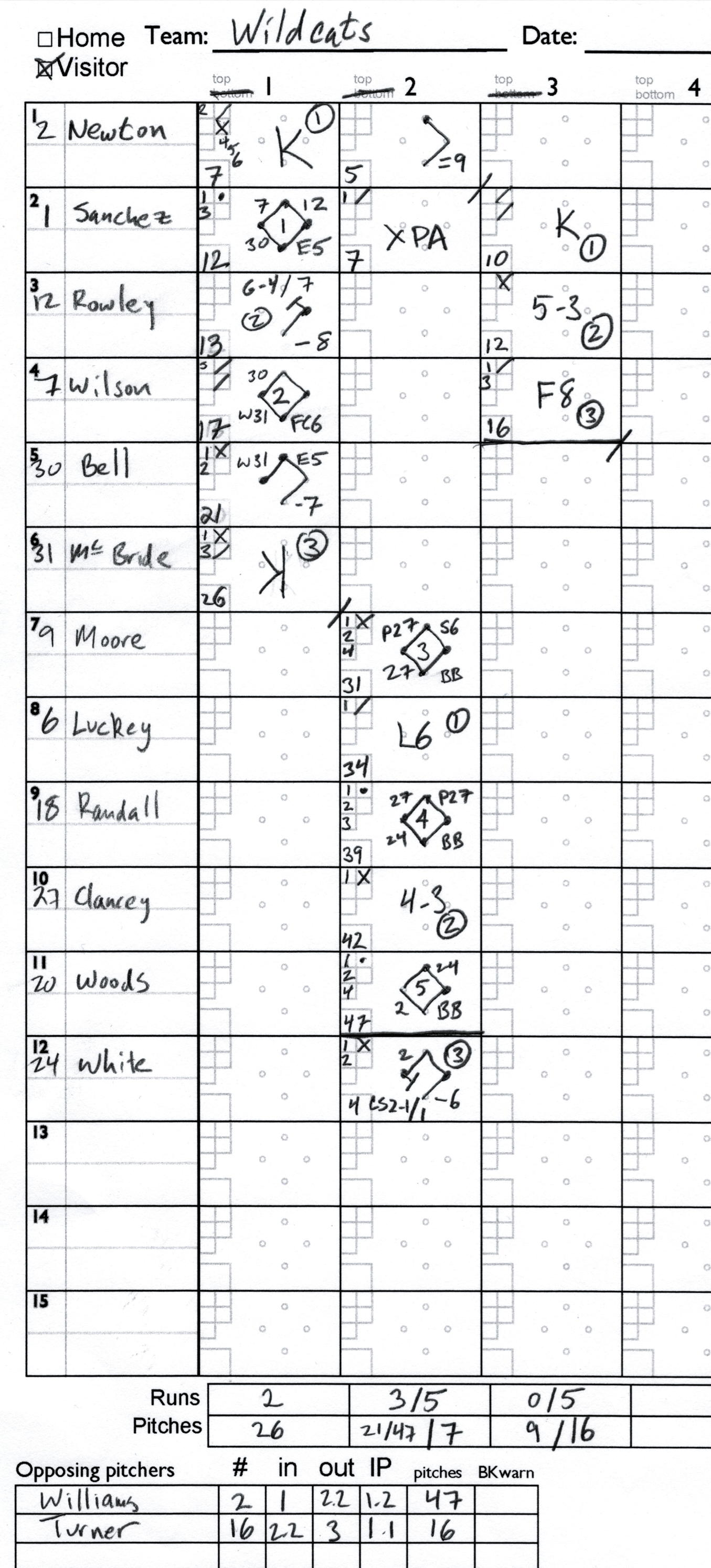
Narrative:
First inning
- Newton Williams pitching. Swinging strike, ball, four foul balls, swinging strike for out 1
- Sanchez Ball, called strike, ball, reaches on error by third baseman
- Rowley Singles to center. Sanchez advances to second.
- Wilson Two swinging strikes then a ball. Ball hit to shortshop, who throws to second baseman to put Rowley out for out number 2. Wilson safe at first on the fielder’s choice, Sanchez to third.
- Bell Two balls, foul, single to left but advances to second on an error by the third baseman. Sanchez scores.
- McBride Ball, foul. Wild pitch ball in which Wilson scores and Bell advances to third. A swinging strike, then a called strike three. Inning over, at 26 pitches.
Second inning
- Moore Ball, foul, three more balls to walk
- Luckey Ball, swinging strike. Moore steals 2nd. lines out to shortstop for the first out
- Randall Three balls, called strike, ball four walk
- Clancey Ball, gets away from catcher. Moore advances to third, and Randall to second, on passed ball. Foul. Groundball to second baseman, who throws to first for the second out. Moore scores, Randall to third.
- Woods Ball, called strike, three more balls to walk
- Turner pitching Williams lasted 1 ? innings and threw 47 pitches.
- White Ball, foul, Ball, single to short. Randall scores, Woods to second.
- Newton first pitch double to right field.
- Sanchez Ball. Then a swinging strike that gets away from the catcher. White tries to score, but is tagged out as by the pitcher on a throw from the catcher. Three outs. Sanches will be at the plate in the third.
Third inning
- Sanchez Three swinging strikes for first out.
- Rowley foul, grounder to third who throws to first for the out.
- Wilson Ball, swinging strike, ball, fly out to center field for the third out.
Note on ‘XPA’: Most scoring schemes don’t address the situation where the third out is a pickoff or caught stealing. If you’re not counting pitches, you’ll have nothing for the score box. But if you are counting pitches, you’ll have already marked the pitches thrown, and need keep the running pitch total going. So I write XPA, PA for Plate Appearance, and X to indicate it doesn’t count as a plate appearance.
Note on passed balls, wild pitches, and steals: Although the narrative inserts these into the sequence of pitches during the plate appearance, the notation doesn’t contain any record of which pitch they were associated with.
February 28, 2020 No Comments
APS March Meeting 2018 Epitome notes
Here are some of the things I came across while putting together my nicely formatted versions of the Epitome and Invited Speaker list for the 2018 APS March Meeting.
The first thing is, that as of 9am on Monday, February 26th, one week before the March Meeting, Session R16 is blank. Its supposed to be an invited session, but there are no speakers, no titles, and not even a “TBD.” Considering the session title, is this supposed to be a sort of backhanded statement?
The rest of these are inconsistencies mainly of interest to someone who’s trying to parse and reformat:
I mentioned in my earlier post using a regex to find chemical formulas, because the subscripts are no longer written out as LaTeX directives and are most often printed straight out. A number of things inadvertently match as chemical formulas (the middle initial “W”), but since the typesetting only changes when there are numbers, this isn’t really a problem. The “Tc” in “High-Tc” will match, and while leaving “Tc” as is would be fine, it’s easy enough to capture this and replace with High-Tc.
There are a few titles that were wholly put in quotation marks; these are unnecessary and can be stripped, but for titles that use quotation marks to set off a phrase, they were set with straight quotes, which should be transformed into open and close quotes for typesetting.
The March Meeting has 14 schedule blocks, 3 a day Monday–Thursday and 2 on Friday; these blocks are labeled with letters. Within each block are up to 59 parallel sessions. A session will have 15 contributed 12-minute talks, 5 invited 36-minute talks, or some combination of these. Some topics have enough contributed talks that there will be multi-part sessions, which are designated with roman numerals. The most popular such session this year is Devices from 2D Materials, which has eight parts. The topic First-principles Modeling of Excited State Phenomena in Materials has seven parts.
But somehow, the (lonely?) session “Coherence and Quantum Aspects of Living Systems I” does not seem to have a second part.
Subtitles are set off both with colons and with dashes. The dashes ought to be typeset as em dashes (—) with no space between the dash and text, but in the Epitome, there are at least three ways the dashes are printed: as single or double hyphens with space surrounding (” — “, ” – “), or a space and a hyphen (” -“). I convert all these dashes to em dashes for printing, but keep the colons.
I decided to tally these with my python scripts this year. There are three ways the Roman numerals are presented: at the end of a title, with no following text; preceding a subtitle, or in parenthesies. It’s fairly easy to make a regex that matches roman numerals, but it can capture too much, so I used positive lookahead to make sure it was one of these categories. But since X-ray also has a following dash, I had to make sure it was excluded!
But I wonder about the folks planning Advances in Computational Statistical Mechanics and their Applications. They’re labeled “Part 1,” “Part 2,” and “Part 3.” Do they have something against Roman Numerals? In all the years I’ve been going to the March Meeting, this is the first time I’ve noticed Arabic numerals to designate a multipart session.
February 26, 2018 No Comments
March Meeting 2017
Back when I regularly updated this blog, I’d post about the APS March Meeting. I’ve been going to the March Meeting since 2003, only having skipped 2014. Every year since 2006, I’ve scraped parts of the program with some evolving Tcl scripts in order to re-format them in ways that make sense to me and let me sort through the immense schedule and figure out which talks I want to see. This year I could 734 sessions and 1030 Invited speakers. I estimate there are 8300 contributed talks and 1175 posters.
It’s too much to read through all the titles (let alone abstracts) of all the contributed talks, so the first step is to nicely format the session titles. I put them on one page, use typography to distinguish Focus Sessions and Invited Sessions, and indicate the total number of invited talks.
It is feasible to skim through all the invited talks, if presented correctly. I group them by time block and session, and include the author name and talk title. This way, I can look for topics that look interesting and speakers I know to be good. And I do look through the whole thing. The APS does have a list of invited speakers, but it’s listed alphabetically by author, which might inadvertently lead one to pick conflicting talks to attend, and also makes it hard to search for interesting topics.
Finally, I make a session/block grid, to show the overall structure of the meeting.
Here’s what I have for the 2017 March Meeting:
March 12, 2017 No Comments
Diagnostic post
This is a second diagnostic post, to see how the WordBooker plugin settings work. This is supposed to show up as a status update in my facebook.
November 11, 2011 No Comments
Blogging again?
Yes, this blog has been idle for many months now, but that doesn’t mean I don’t have dozens of potential blog posts mulling around in my head. This is my second diagnostic post, to see if the WordBooker plugin works, which is supposed to be a way to post my new blog posts to my Facebook wall. (The first diagnostic didn’t post to Facebook, do it’s been deleted. Sorry if that interfered with your RSS reader.)
November 11, 2011 No Comments
The New Sierra Club Executive Director
A recent (January 30, 2010) episode of Sierra Club Radio begins with an interview of the new executive director, Michael Brune, which was the first I’d heard in detail about him. I found it quite encouraging, in part because of what Mr. Brune said, but more refreshingly, in his tone. The outgoing executive director, Carl Pope, periodically recorded commentaries for Sierra Club radio, which I never really cared for. Mr. Pope’s tone was brash, smug, and confrontational, and his messages were needlessly political: hyping up small or incidental or Phyrric victories, spinning away the setbacks, never allowing that an issue might have subtleties and complications. There were good guys and villains, and the good guys were always winning, most likely thanks to the Sierra Club and its allies. Carl Pope’s commentaries always sounded like a slightly disingenuous pitch. Mr. Brune, by contrast, sounds very much like a thoughtful person.
That I picked up on this contrast is perhaps a bit ironic, as Mr. Brune as an activist was known for a rather confrontational style, as elucidated in a Living on Earth interview, a KQED Forum interview, and in a Grist article. Prior to the Sierra Club, Mr. Brune was executive director of Rainforest Action Network, where his most notorious stunt involved the campaign to get Home Depot to stop buying wood from endangered forests. Sympathetic Home Depot employees contacted Mr. Brune and clued him in to the code for the Home Depot intercom system, by which Rainforest Action Network activists could go into any Home Depot, find the intercom stations, and broadcast messages storewide about the source of the wood products for sale. This campaign worked, although I’m not really sure this is the sort of thing I’d like the Sierra Club to start doing more of.
Mr. Brune made what I think is a salient and subtle point in praising the Sierra Club for “evolving” over the past decade or so, of doing a good job of “holding onto its roots”–protecting wild places and the like–but at the same time “being responsive to the great threat of climate change.” This phrasing speaks to me–it signals an understanding that the environmental challenges we face and our responses to them are not identical to those of twenty or thirty years ago. Urban environmentalists often note a disconnect with what we might call “traditional” environmentalism, manifested as an insistence in saving every tree, and in opposing every development, and in always primarily characterizing the principals involved in any development as greedy, even if the trees that would have to be cleared to make way for a development would enable its future residents to live in ways–without cars, for example–that could drastically reduce their overall environmental impact when compared with what they might need to end up with should the traditional environmentalist’s protests be successful and should the greedy developers choose to build their buildings instead on some further-flung plot of land that’s less dear to said environmentalists. I’m oversimplifying the issue here of course, and I don’t want to presume that when Mr. Brune says the Club is evolving that he necessarily means that it will evolve exactly the way I want it to. But it does seem to me that Mr. Brune is acknowledging the need to look at environmental challenges in a different way than has been considered traditional.
Two years ago, he wrote Coming Clean–Breaking America’s Addiction to Coal and Oil, published by Sierra Club books. That energy was the topic on the mind of someone employed to save the rain forests is, itself, encouraging. He was interviewed on Sierra Club radio for September 6, 2008 upon release of the book, and this earlier interview is perhaps more insightful than the current one. He struck a thoughtful and diplomatic tone, giving respectfully detailed answers to complex topics. He discussed, at some length, the problems with biofuels, beginning with a remark that the idea of growing your own fuels is, no doubt, very alluring. He concludes that “biofuels can only at best be part of the solution” and further noting that if we were to turn every single last ear of corn produced in the United States into ethanol, it would provide a scant 12% of our fuel needs. He resists the temptation to simply classify biofuels as “good” or “bad,” and he uses a quantitative figure in a proper and meaningful way, which is more than can be said of much of what passes for environmental discourse these days. The urbanist will also note that he also understands that biofuels are an attempt at a solution to what is in many respects the wrong question–instead of asking how we’re going to keep fueling our cars in a post-carbon age, we should also be asking whether we need so many cars to begin with. Brune mentions, several times, that “we need to promote ways of transportation that are not centered on the automobile.” When asked for ways in which individuals could get involved in breaking our oil addiction, he suggested getting involved with your local bicycle advocacy organization, to get more bike lanes and to encourage office buildings to offer bicycle parking.
It also appears–although not having read his book, I’m not certain–that he wants to play down the role of individuals greening their own lives and instead look towards action for large-scale, widespread institutional change. In the 2008 interview, the host specifically asks him about a claim in the book that individual actions, like turning down your thermostat and changing out your lightbulbs, won’t be sufficient to solve the climate change problem. And although he’s not as polemic as Mike Tidwell’s Washington Post Op-Ed, the sentiment is the same: to make the changes that matter, we need large scale, collective action. And Brune makes clear in the current interview that be believes that there is no organization better suited to lead this action than the Sierra Club.
Brune, I couldn’t help but notice, is only two years older than I am, and is probably as young as one can be to also have enough experience to be considered a reasonable candidate for executive director of an organization with the size and stature of the Sierra Club. Carl Pope, I gather, is a few years younger than my parents. So there really is a transition here, a passing of the baton from one generation to the next. I’m optimistic about Brune, and will watch carefully to see where the Club goes.
February 8, 2010 1 Comment
Making sense of the March Meeting
This year’s March Meeting will be in Portland, Oregon. (See previous blog posts from 2009 and 2008, also here.) The largest of the meetings put on by the American Physical Society, this year it there will be 581 sessions and 818 invited speakers. Most time blocks–from Monday morning through Thursday mid-day–will have a full program of 42 parallel sessions. This is slightly larger than last year, in which most time blocks had 41 parallel sessions, with a total of 562 sessions. There were 832 invited speakers last year, so this year has slightly fewer. As each session can have up to 15 contributed talks–10 minutes each with 2 minutes for questions and changing speakers, or 5 invited talks–30 minutes each with 6 minutes for questions and changing speakers, that means there could be almost 6800 talks all total, but most sessions aren’t completely programmed. This year, I am not giving a talk.
With such a mass of talks going on, planning your time at the conference and deciding how long to stay take some effort. In the past, abstracts for all talks, and the 2000 or so posters that the meeting has each year and were printed in two volumes that resembled phone books, plus a pocket sized book of session titles. These days, one gets a smaller books that lists only the titles of the talks, and of course the entire program is also available online. Nevertheless, over the years I’ve found the layout of the program to be a bit wanting, and so I put together some scripts that parse the schedule and author information to print it out in a form that I find easier to work with.
My scripts and their outputs have evolved over several years, and currently they produce three files. They take as input the Epitome, which is a chronological list of sessions, and the list of invited speakers. At present, both of these must be cut-and-pasted from the meeting website into text files for my program to read. (Maybe next year I’ll have them automatically grab the files from the APS website.)
The first output file is a version of the Epitome more suitable for browsing on a printed page than the materials for APS. It skips the non-talk sessions (like receptions and unit business meetings) and makes sure all sessions of each time block are together on a single page.
The second file serves to give a sense of the structure of the March Meeting: it is a grid of time blocks versus session numbers, with symbols indicating the number of invited talks in each session. It also has a list of room numbers associated with each session number: for the most part, all sessions of a certain number (such as A14, B14, D14, and so on) will be in the same room, but not always.
The third file is a list of invited talks, sorted by session instead of by author last name. Because of the large number of parallel sessions and the high likelihood of schedule conflicts, I think it makes sense to look time block by time block.
Since this year I’ve actually got these files produced well before the meeting, I’m posting them here in case anyone else should like to use them too.
Here are the three PDF files I’ve generated:
If you like the information but want to fiddle with the formatting, here are the .tex files that generated the PDFs, that need to be run through LaTeX. Because of a quirk in WordPress, they’re all saved as .tex.txt. The APS online information already uses TeX formatting for accent marks in speaker names, and for super- and sub-scripts in talk titles. (There are occasionally errors in APS’s TeX formatting–this year, the title of Philip Anderson’s talk is missing the math mode $ characters surrounding the ^3 superscript command. Despite my efforts to automate everything with these scripts, fixes like this still must be done by hand.)
Finally, here is the Tcl script that I use to parse the files and write the .tex files. It’s not very good code, having been mucked around with once a year for a few years and in general cobbled together from earlier scripts. It works, provided the settings file is appropriately edited, on march meeting files back to 2006, when the invited speaker list was first published online. The bits that work on the epitome work on 2005, and the epitome format in 2004 and earlier years was different. As with the .tex files, I’ve needed to upload them as tcl.txt files here.
In a future post, I hope to use the results of the scripts, particularly the grid, to analyze ways in which the March Meeting has changed over the years.
January 31, 2010 1 Comment
The city becomes beautiful again
The cherry blossoms have come and gone now: two weeks of blooming and four days at the peak. A few pictures of my son enjoying the blossoms made their appearance on the Matthew Picture of the Day. The blooms are the most dramatic signal of the arrival of spring: there are a handful of other plants that bloom one way or another before the cherry trees do, but the cherry trees go from bare branches to large masses of fluffy pinkish-white rather dramatically.

Now the blossoms have blown away, and trees of every type are getting their leaves, and for a week or so the trees are all decorated in Spring Green. I had known about the Crayola color Spring Green since childhood, but it wasn’t until I was living in Ithaca that, after a characteristically long winter, I really understood what it meant. The very light and yellowish green of the nascent leaves on the trees across the street from my apartment were Spring Green; it was finally spring.
So now we begin the six or seven months in which the foliage and blooms of the plants around us make the city beautiful. This is capped by a month or so of fall foliage, after which nature’s beautification fades, slowly, and the seasonal decoration takes over.
Between Thanksgiving and New Year’s, holiday lights make the otherwise bleak city beautiful. Strings of white lights outlining houses and filling in shrubs, some overdone, some very subtle: they compensate for the dwindling sunlight and dormant vegetation. In Ithaca, we got our first snow around Thanksgiving, here in DC it comes much later, usually in January. Snowfall is only very briefly beautiful, when it’s still piled up on otherwise bare branches, and while that on the ground hasn’t been disturbed very much. Then in a few hours, it drops from branches and twigs, and snowplows and other traffic have turned much of it into a dirty grey mush.
One thing I can’t understand is why it is that the holiday lights that made the streets seem so inviting in December look so tacky in the middle of January. The weather is the same, the hours of darkness are much the same, yet holiday lights, and the greens, golds, and reds of Christmas look fantastically out of place. I suppose we’ve been trained by the retail industry to appreciate bold reds and whites, à la Valentine’s day. Is there anyone who actually buys such seasonally-colored servingware from the yuppie housewares catalogs? And after Valentine’s day, as the dreary bleakness of winter presses on, we imagine spring in pastel colors. And then spring happens, like it’s happening now, here in DC.
April 18, 2009 1 Comment
A new time sink
It seems like just yesterday that facebook was, well, the linked online student directory for Harvard. Then for other colleges. And I remember some dust-up when the college kids objected to the plan to let high school kids on.
But now, it seems everyone is on. My wife joined last week, and so I’ve decided it’s time for me to jump on the bandwagon as well.
But I don’t know if I’ll ever get used to using the word “friend” as a verb.
September 20, 2008 No Comments
Long time, no post
It’s really amazing, how once a week goes by in which I don’t post anything to this blog, it’s very easy for the next week to roll on past with no posts either. Sort of similar to the way it becomes harder and harder to reply to an email, the longer it sits in your inbox.
This evening, I saw Amtrak‘s southbound Crescent as it was pulling in to Union Station. Since my schedule is somewhat regular now, I manage to see this train every few weeks, because it’s scheduled to arrive just at about the time I’m almost home on the Metro. Yesterday, on account of an early arrival home, I managed to catch a glimpse of the Capitol Limited, which is a treat because it’s the only Superliner train that comes to DC. Simple pleasures.
Last week I was in Wisconsin, at “The Lake,” the annual gathering of my extended family. I hope to blog about “The Lake” soon.
I do have other posts in the works: about French Trams, about the way the Brompton has changed my commute, and a review of Outside Lies Magic. I do hope to get around to writing them all.
August 14, 2008 No Comments